     I studied fashion in college, where we learned about color, symmetry, proportion and other design elements that make a garment "successful". It sounds silly, but I apply the same things I learned about designing a piece of clothing to my Instagram feed. For me, color in particular is one of the most important aspects of creating great imagery and curating an aesthetically pleasing feed. Many people think using the same filter is all it takes for a consistent feed, but it's important you shoot the right colors in the right locations as well. Below are some tips for a consistent feed and photos that pop.
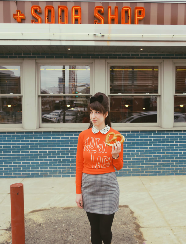
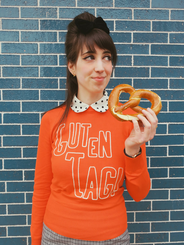
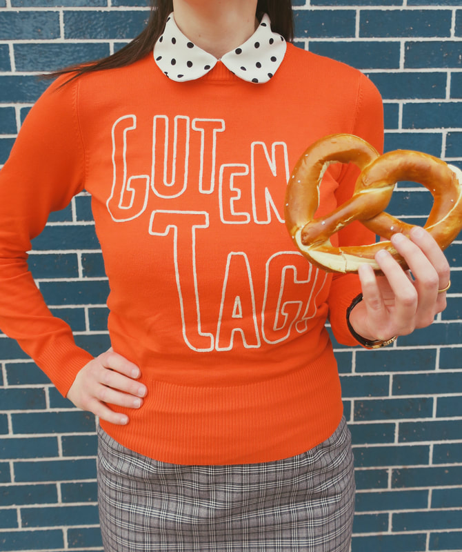
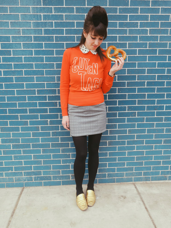
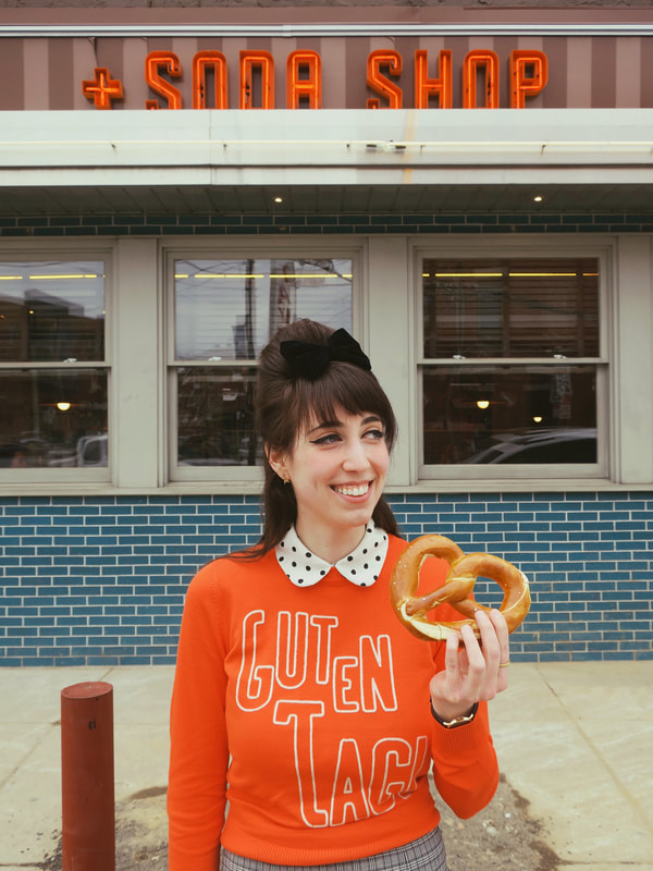
•utilize complimentary colors: I am big on utilizing complimentary colors in my photos, which are colors that are opposite on the color wheel. If you need a refresher, the complimentary color combinations are as follows: red and green, blue and orange, and yellow and purple. I feel a lot of bloggers go the monotone route when taking photos. For example, if they're wearing a primarily pink outfit, they'll place themselves in front of a pink location. I personally prefer to find a location that is opposite of my outfit. These photos are a perfect example, since I'm wearing an orange sweater in front of a blue wall. The neon orange sign in the background perfectly ties the whole photo together since it coordinates with the sweater as well. PS if you'd like to shop my sweater, you can find it here: https://joanieclothing.com/product/gertie-guten-tag-slogan-jumper/ •stick to one color palette for your feed: My Instagram feed is mostly primary colors (red, yellow, blue). I also have neutral colors, like brown and black, in there as well, to tone it down and add to the vintage feel. In general, I make sure whatever photos I'm posting fall into this color palette. •stick to the same color tones: In addition to utilizing the same colors, stick to the same tones of those colors. For example, I usually have a lot of red pops in my feed. However, there are so many shades of red, from bright cherry red to burgundy. Some reds are cool with a blue undertone, others are warmer with a more orange undertone. I personally usually aim for a more red-orange in my feed. •balance out photos: If you do find yourself wanting to post a photo of something that is a color outside of your usual palette, find a way to balance out the photo. For example, in my last blog post, I was wearing a pink dress, but I hardly ever have pink in my feed. However, I think the photos still worked overall because of the background colors, there was a good amount of brown and blue, two prominent colors in my palette. •ignore the rule of 3: I know a lot of bloggers follow "the rule of three", when they post three photos of the same color in a row, or strategically place the same color photos so they make a diagonal or a triangle. I don't follow this rule, because it's too time consuming and honestly will just drive you crazy trying to get everything so precise. It's nice when my photos happen to align that way, but in general I just make sure my photos have the same feel and flow nicely into one another. •use the same filter: Using the same filter every time you edit really helps to give your photos a consistent feel. I'm thinking of doing a tutorial on how I edit my photos, as I get a lot of questions about what apps I use and how to get the vintage effect, so stay tuned for that if you're interested! Sweater: c/o Joanie Clothing https://joanieclothing.com/ Skirt: May 68; Collared Shirt: Forever 21; Bow: Claire's; Shoes: LF/Life Location: Joe's Steaks (Fishtown, Philadelphia)
0 Comments
Leave a Reply. |
Archives
August 2023
|
 RSS Feed
